
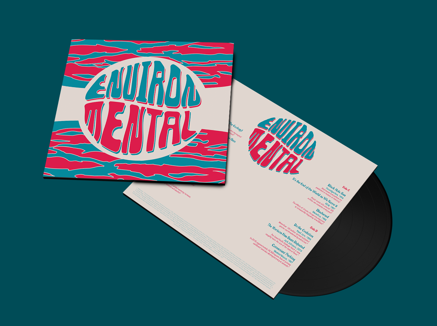
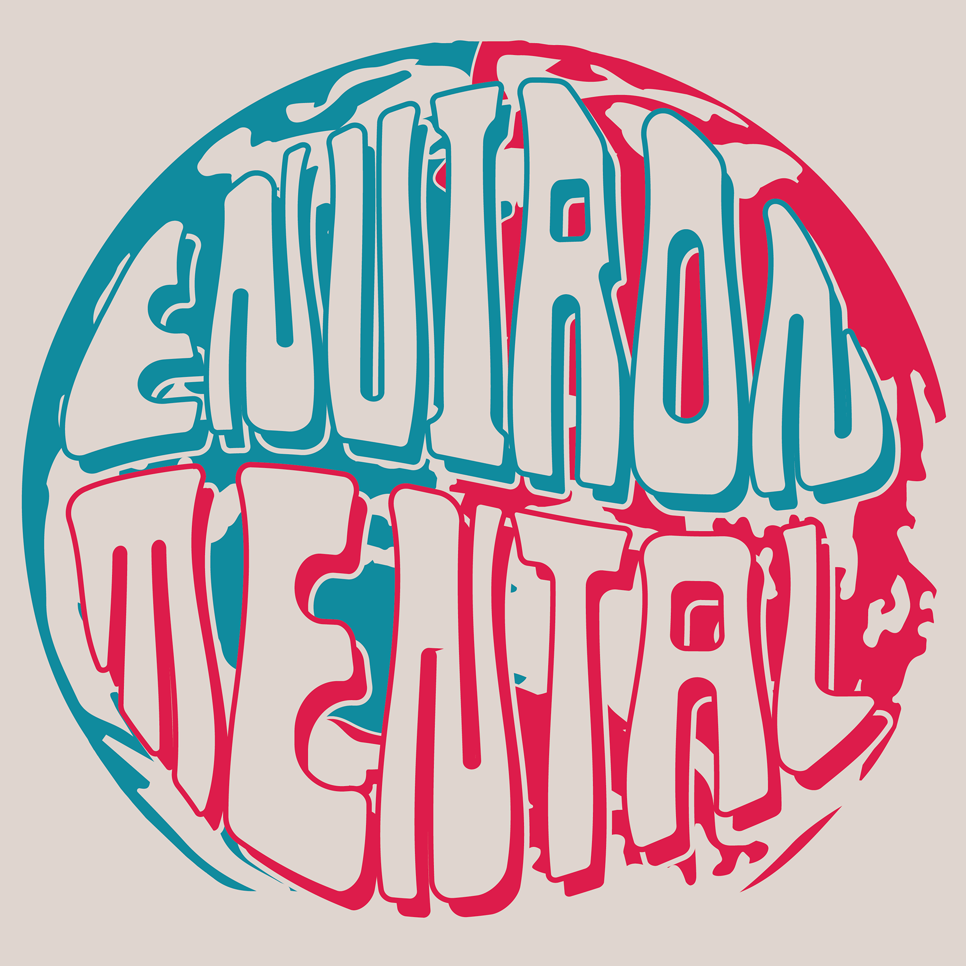
EnvironMental Record Sleeve
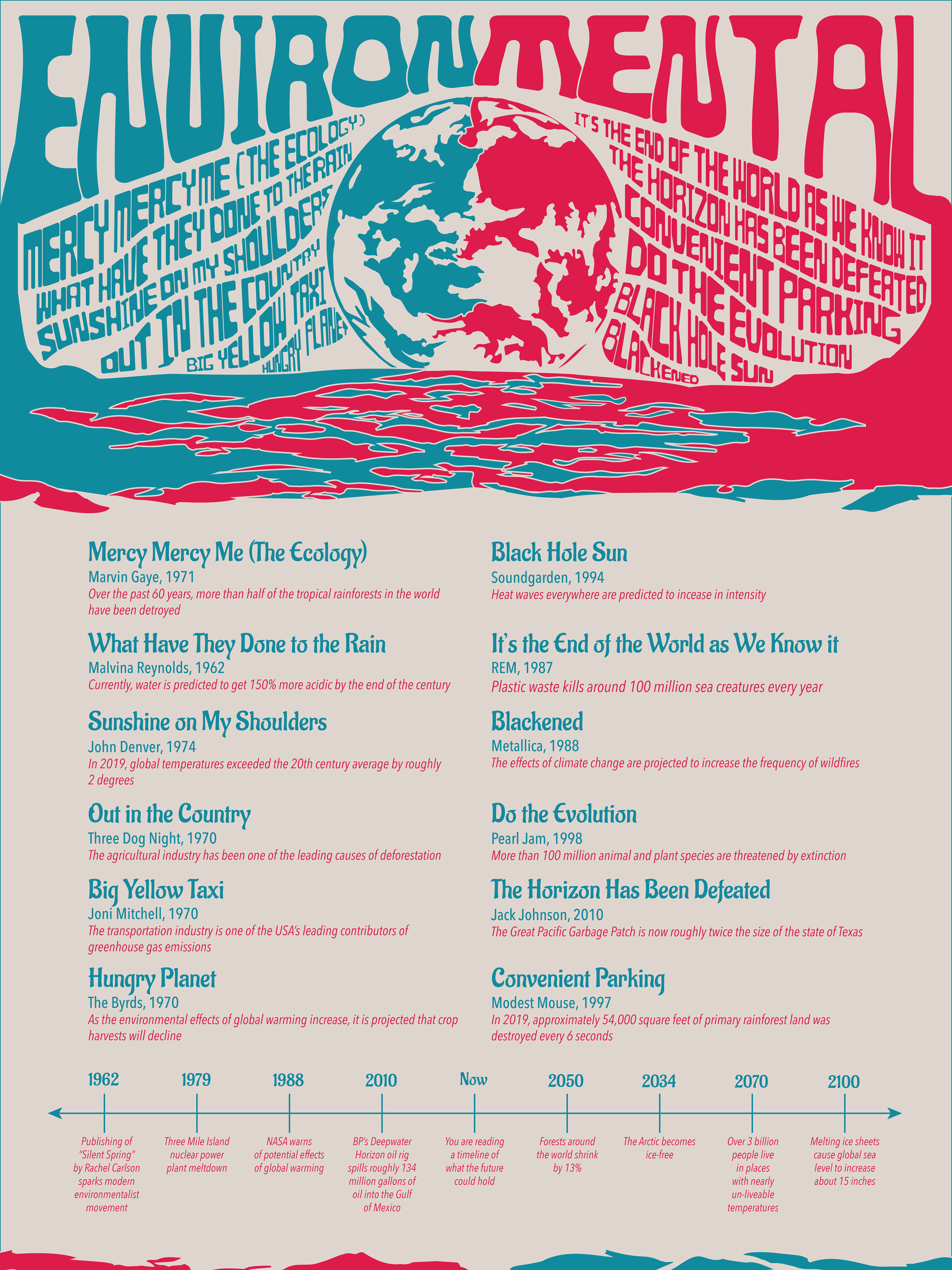
EnvironMental Poster
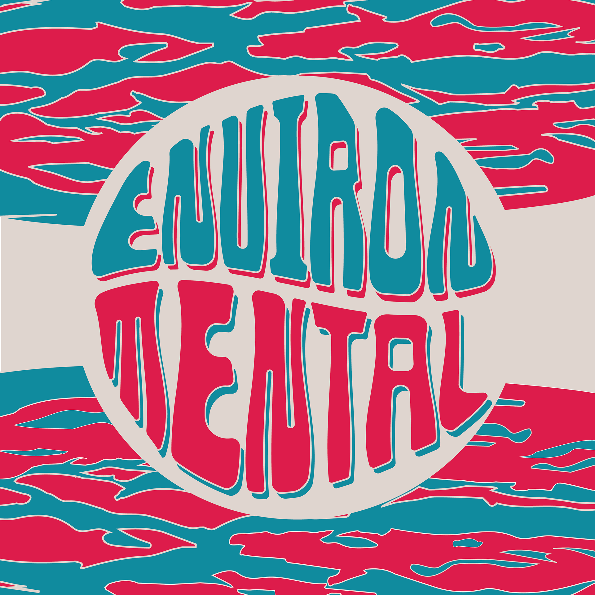
EnvironMental CD

EnvironMental T-shirt
EnvironMental Pin
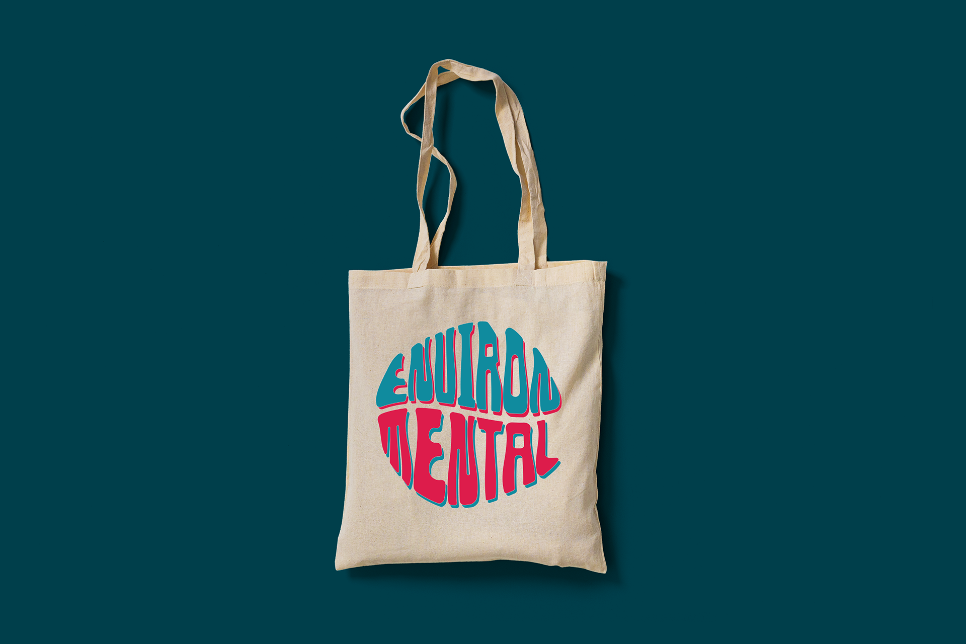
EnvironMental Tote Bag
Research
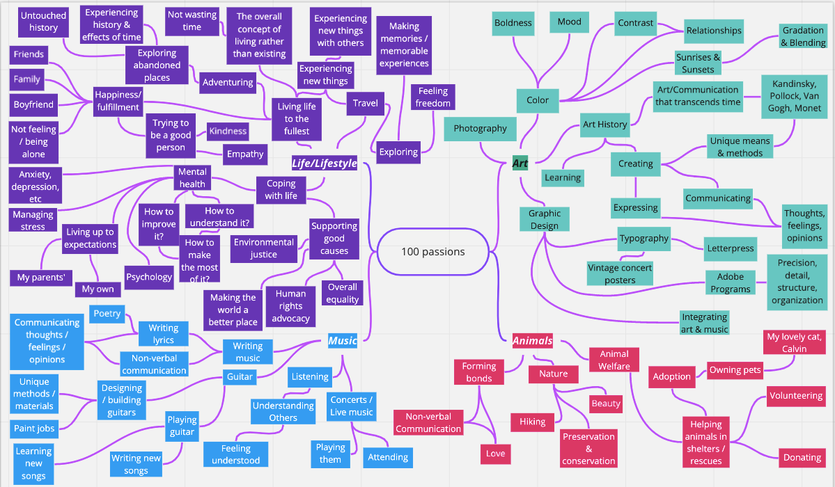
100 Passions
The first step of my process for this project involved identifying and listing out one hundred of my passions. The purpose of this list of passions was to help me begin to determine what the focus of my project would be. Through my list, I was able to organize my passions into four main categories: art, music, animals, and life/lifestyle topics. After identifying these categories, I began brainstorming on how specific items from these categories could connect with one another. During the process of investigating these possibilities, I identified keywords that kept sticking out to me. These terms included “counterculture”, “social change”, “music”, and “album art.”
Topic Refinement
After identifying these key terms, I began looking for ways to connect them. I shifted my research to focus on the music of major countercultural eras and how it has connected to social change. During this phase of my research, I started looking at Hippie, Grunge, and Punk countercultures and the causes attached to them, such as feminism, civil rights, peace efforts, and environmentalism. After drawing these connections, I began brainstorming about how graphic design could potentially be used to showcase the relationship of countercultural music and social change. I looked at album cover designs, concert poster designs, and various zine styles and layouts.
"How Might We" Questions
As I began solidifying the general focus of my project topic, I started to work on developing “how might we” questions in order to further refine the goal of my project. One of my early “how might we” questions was “how might we use graphic design to show the influence of countercultural music on social change?” Using this question as a starting point, I began trying to determine what sort of deliverables would be the most effective in answering this question.
One of my initial ideas was to design a series of zines based on the ideals of the countercultures I had researched. I eventually moved away from this idea, though, as I came to the conclusion that zines may not be the most effective solution in today’s heavily digitalized world. Following this, I decided to shift my focus toward album design. I felt this would be an appropriate choice because it could potentially appeal to a larger demographic. Older generations would presumably find a vinyl record design familiar, while younger generation would be drawn by the “vintage” appeal that has become a major trend.
My Diagram of 100 Passions
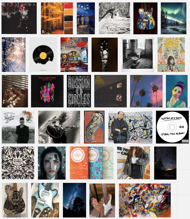
My initial moodboard inspired by my 100 Passions List
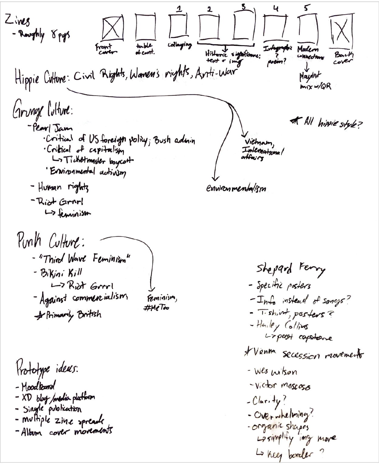
Counterculture topics and zine notes
Moodboard & Visual References
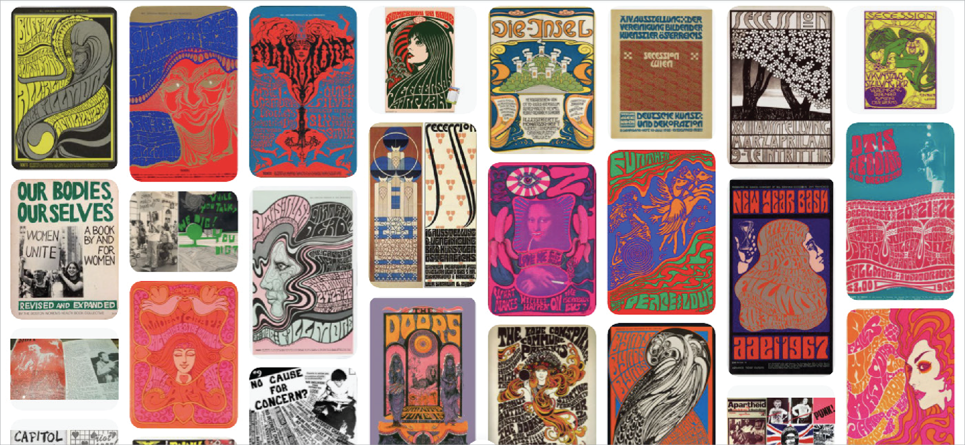
Moodboard featuring psychedelic concert posters, Vienna Session artwork, & counterculture publications/art
![Psychedelic Art Notes: Wilson, Wes. Fillmore Auditorium 12/20-22/66. 1966. Lithograph on paper. Swann Auction Galleries. https://catalogue.swanngalleries.com/Lots/auction- lot/WES-WILSON-(1937--)-[PSYCHEDELIC-ROCK- CONCERTS]-Group-of-5-p?saleno=2510&lotNo=214 &refNo=758765](https://pro2-bar-s3-cdn-cf2.myportfolio.com/c14bc4ad-09e9-42b7-b3f3-08e14e07a28f/3d8e304c-2772-4e59-aec1-376f9123f41a_rw_1200.png?h=4f903a9dc737347180f390e4526849fc)
Psychedelic Art Notes: Wilson, Wes. Fillmore Auditorium 12/20-22/66. 1966. Lithograph on paper. Swann Auction Galleries. https://catalogue.swanngalleries.com/Lots/auction- lot/WES-WILSON-(1937--)-[PSYCHEDELIC-ROCK- CONCERTS]-Group-of-5-p?saleno=2510&lotNo=214 &refNo=758765
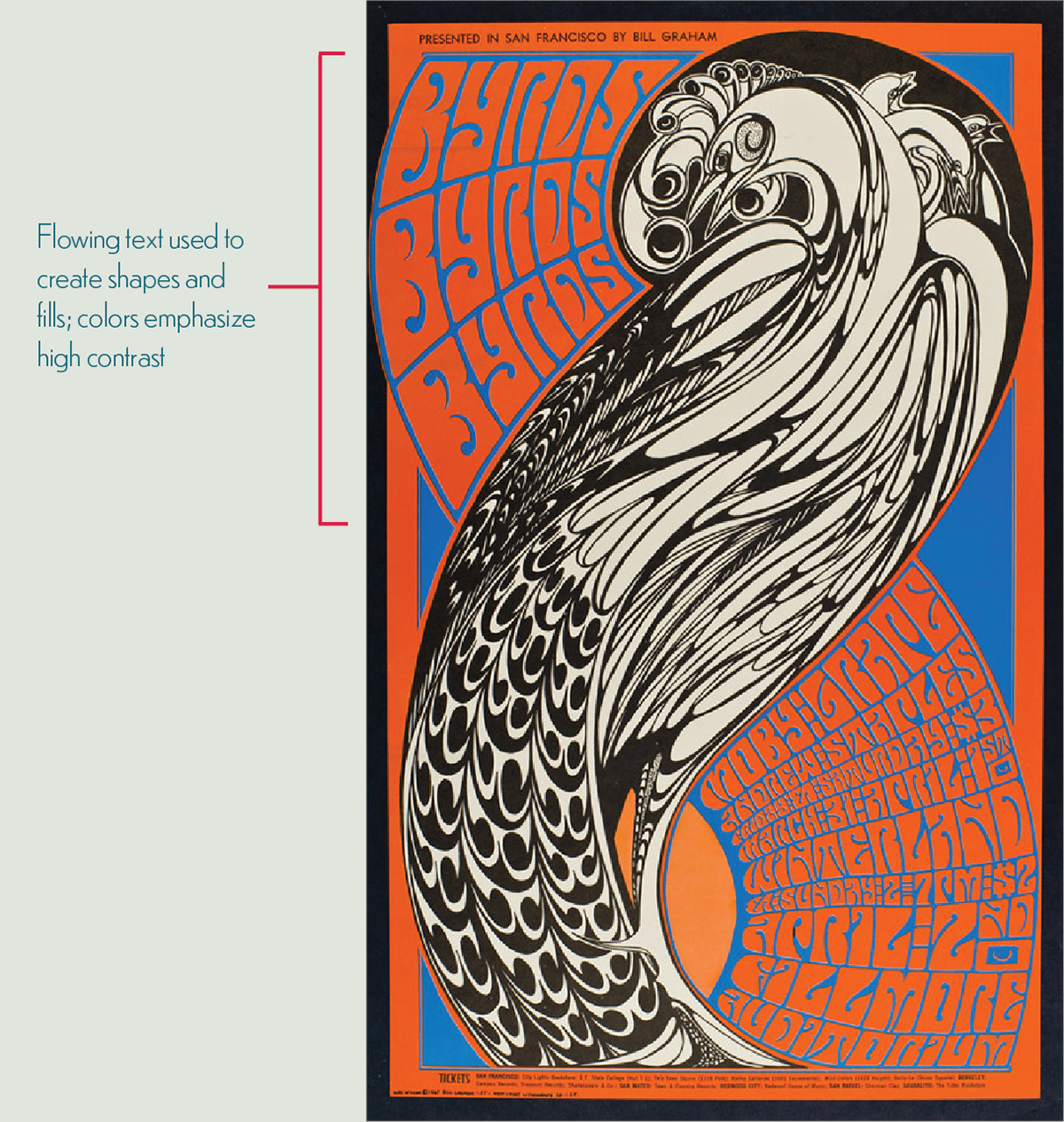
Psychedelic Art Notes: Wilson, Wes. Fillmore Auditorium 4/1-2/67. 1967. Lithograph on paper. Artists98. https://artists98.rssing.com/chan-7486735/all_p5.html#c7486735a88?zx=813
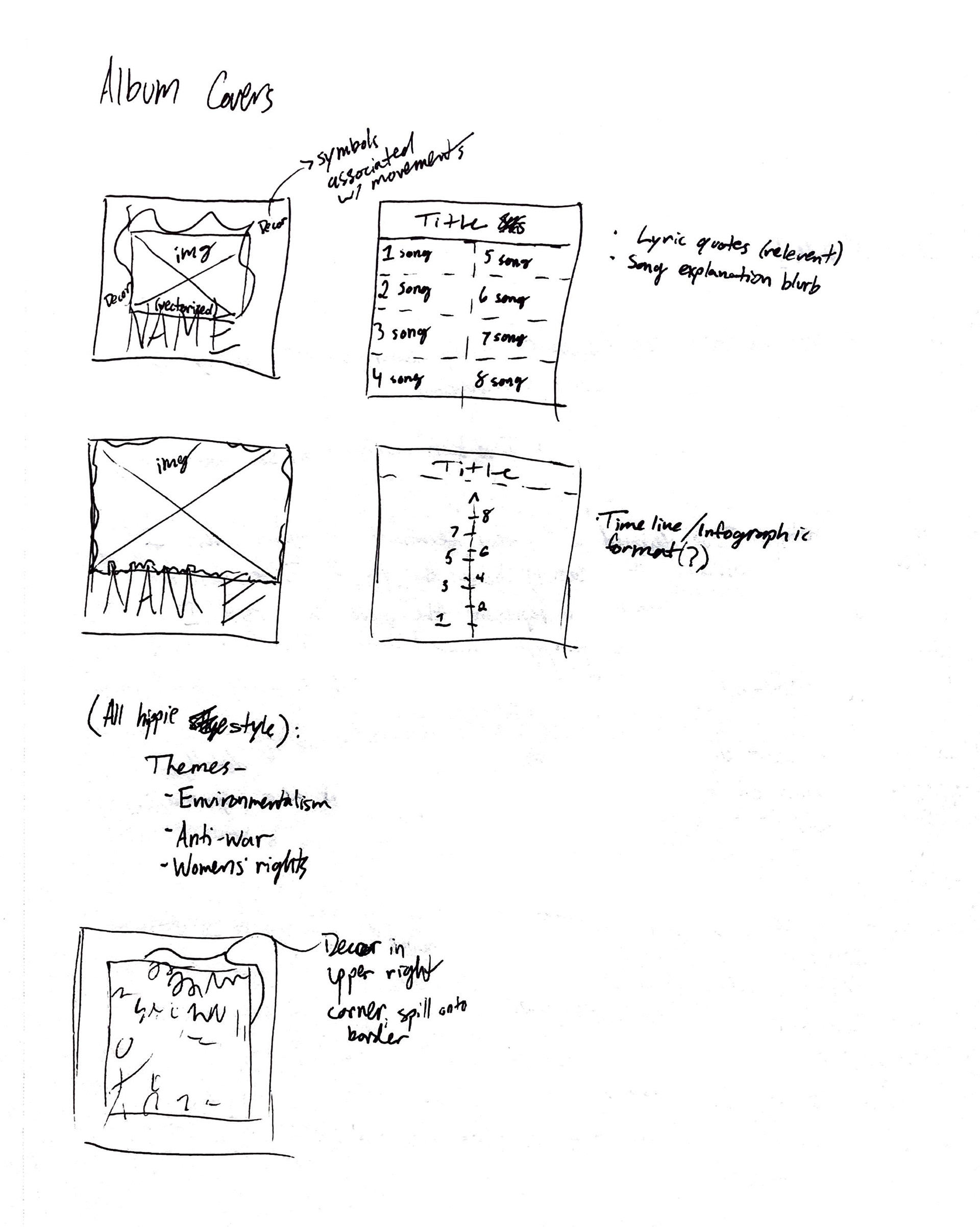
Early Prototypes
Sketching & First Drafts
As I continued my research on the influence of countercultural music on social change, it became apparent that one of this most notable examples of this concept was the Hippie countercultural music of the 1960s. This era paved the way for bringing issues such as feminism, anti-war efforts, civil rights, and environmentalism to the forefront of the public’s mind. The signature style accompanying this counterculture was the bright and bold psychedelic art of artists like Wes Wilson, Bonnie MacLean, and Victor Moscoso.
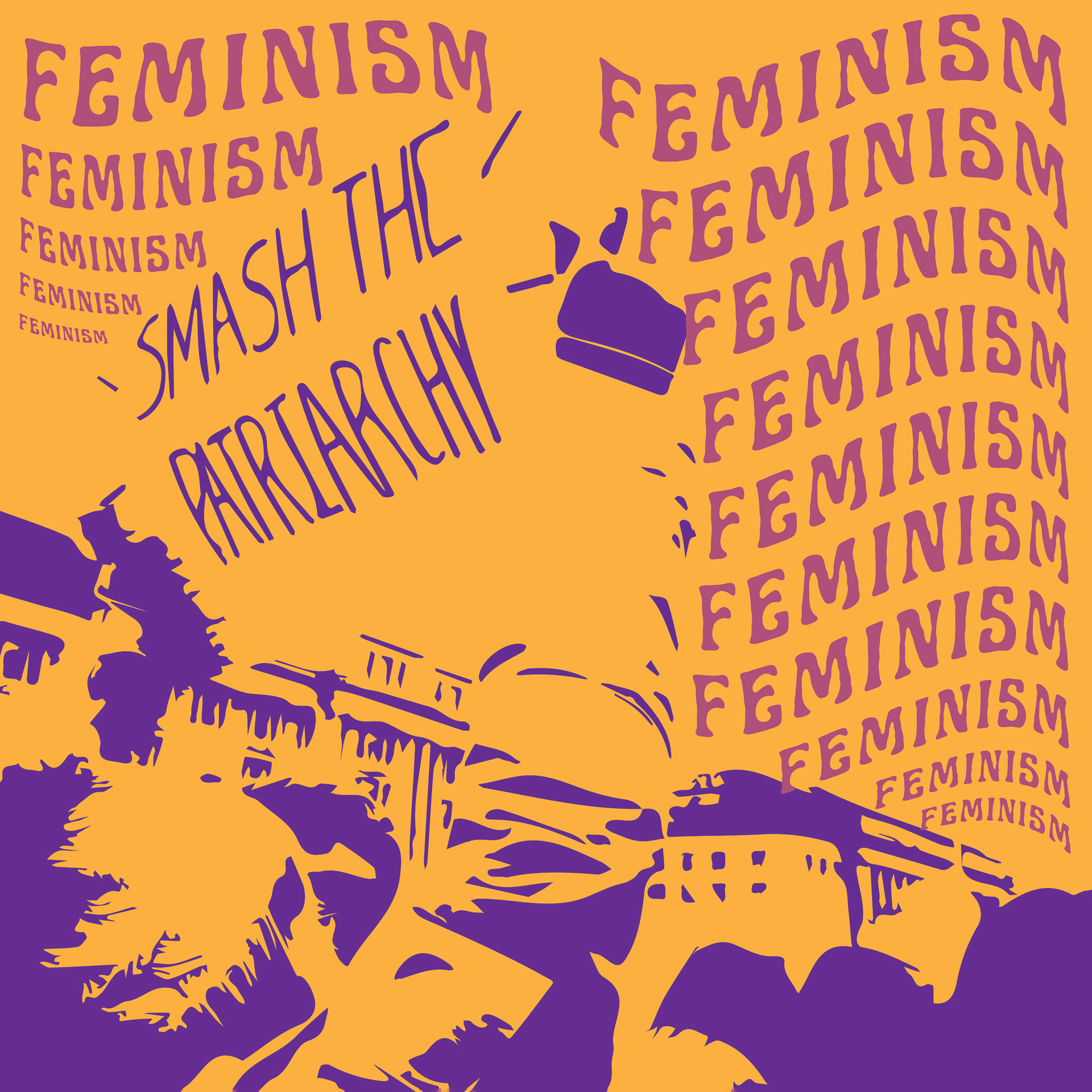
I came up with the idea of designing a series of psychedelic-styled album covers and posters to represent the social movements of feminism, anti-war efforts, and environmentalism. For each movement, I compiled a list of songs dealing with the theme from different decades, ranging from the 1960s to today. By covering this span of time, I aimed to show how many issues that became prevalent in the 1960s are still actively affecting society today. To further communicate this, I decided to use heavily stylized images from modern protests for the album cover and poster designs. In these prototypes, I focused on using the theme of feminism. In these drafts, I experimented with varying levels of detail and typography within the layouts. I used a color scheme inspired by the characteristics of psychedelic art as well as the colors of the Women’s Suffrage Movement.

Feminism Album Front Cover Prototype 1

Feminism Album Front Cover Prototype 2
Feminism Album Front Cover Prototype 3
Feminism Album Back Cover Prototype 1

Feminism Album Back Cover Prototype 2
Feminism Album Back Cover Prototype 3
Feminism Poster Prototype 1

Feminism Poster Prototype 2

Feminism Poster Prototype 2
Pop-Up Session & Feedback
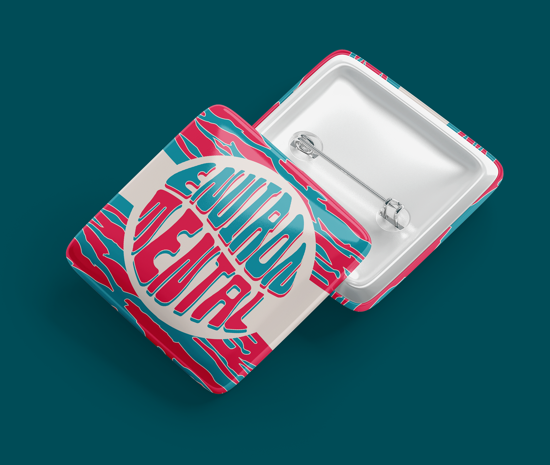
As a means of gathering feedback from outside sources, the Capstone class conducted a virtual “Pop-Up Session” in order for my classmates and I to meet with graphic design alumni and faculty to get new perspectives on the progress of our respective projects. At this Pop-Up, I received a lot of helpful feedback such as possibly choosing one overarching theme and creating a series based on specific issues of that theme rather than developing a series covering three different themes. Another Pop-Up guest suggested looking into more contemporary means of conveying the message, possibly through social media, and provided me with a number of resources for further research. A third guest that I talked to at the Pop-Up suggested the possibility of designing extra merchandising such as stickers or shirts to go along with the project. Many guests that I spoke to had also liked the timeline idea that I had incorporated into the track listing of one of my designs for the back of an album cover.
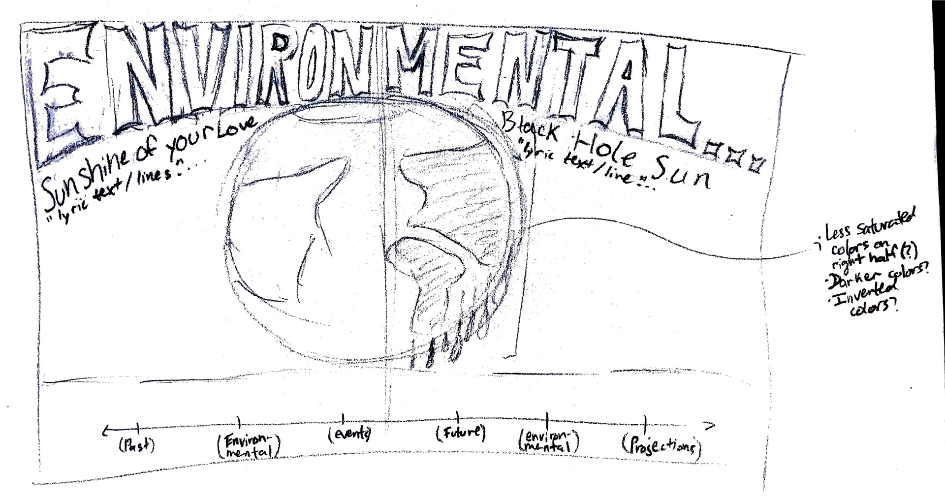
Following the Pop-Up event, I shifted the focus of my project to center solely around environmentalism. I also decided to produce one set of more expansive deliverables rather than designing a series of three sets. I named the project “EnvironMental” (featuring an uppercase “M” to emphasize the word “mental” within “environmental”) to clearly communicate the theme of the project as well as to hint at the craziness of what human actions have done to the planet over the years. I decided to create a 2-disk gatefold album cover design on which to base the campaign and altered elements from my first prototypes, such as the timeline, to reflect scientific projections for the future state of the environment.
EnvironMental Development
Concept Exploration - Inside Cover
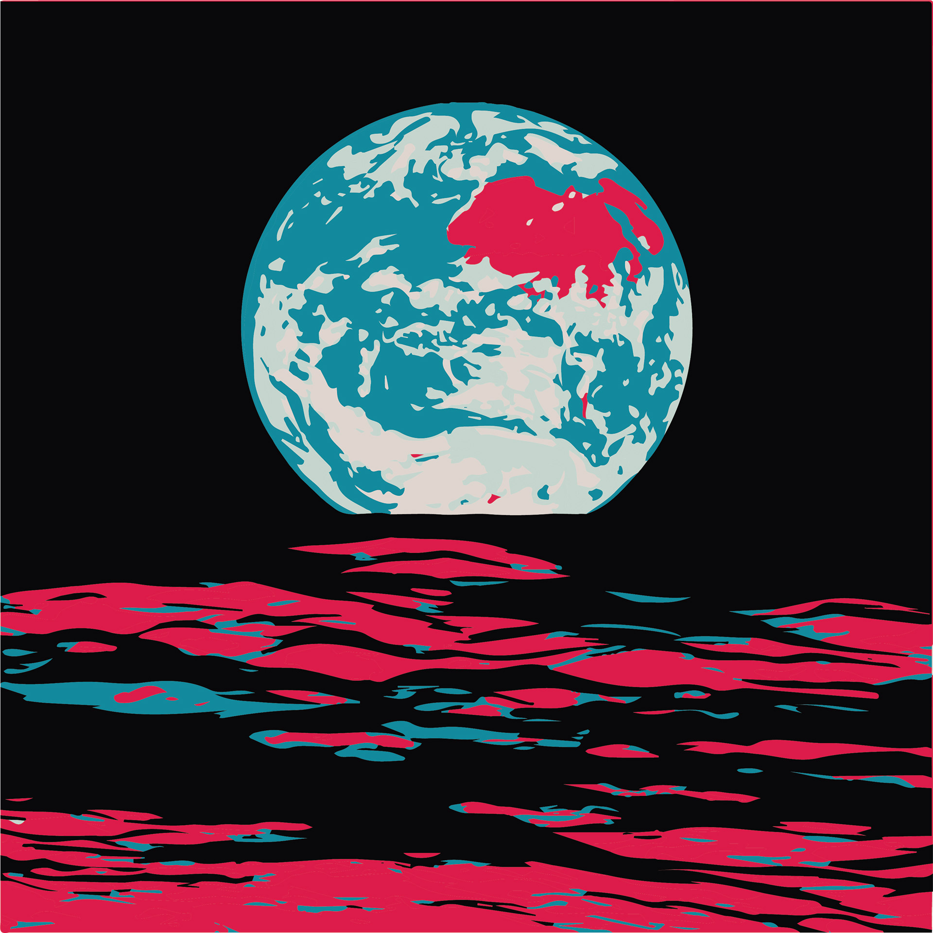
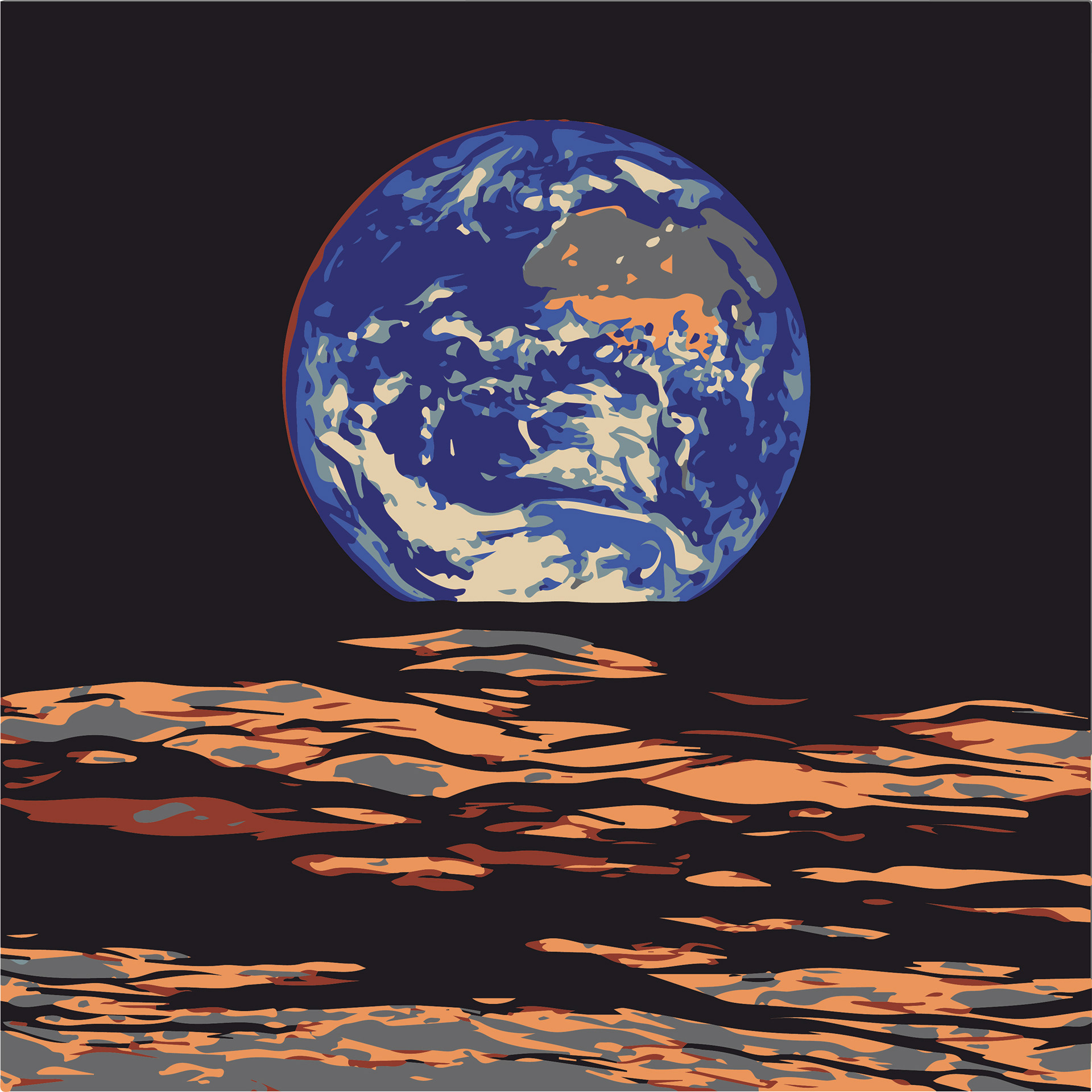
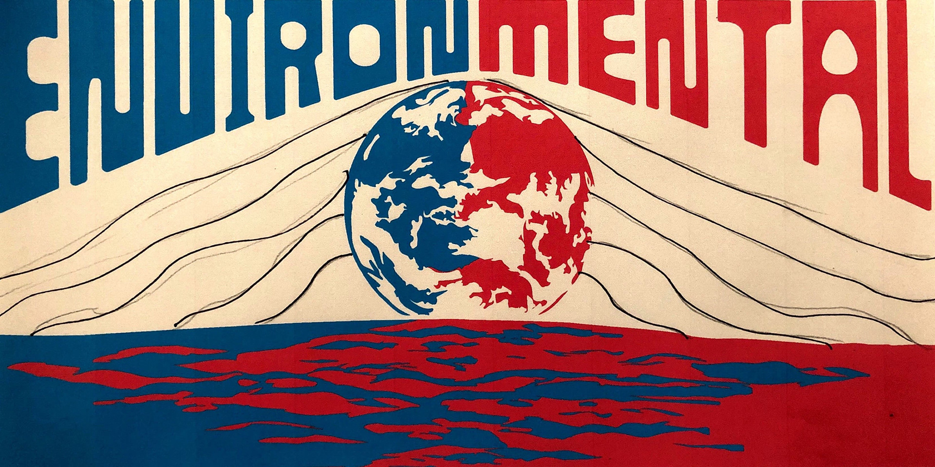
Using my sketchbook as well as Adobe Illustrator, I worked through numerous layout design options and color schemes to use for the inside cover of the EnvironMental album. In the end, I opted to use a photo of the earth (sourced from NASA) as the basis for my design. The color schemes I explored utilized the color combinations featured in my moodboard from various psychedelic posters and Vienna Secession artwork (the historic predecessor of the psychedelic art style).
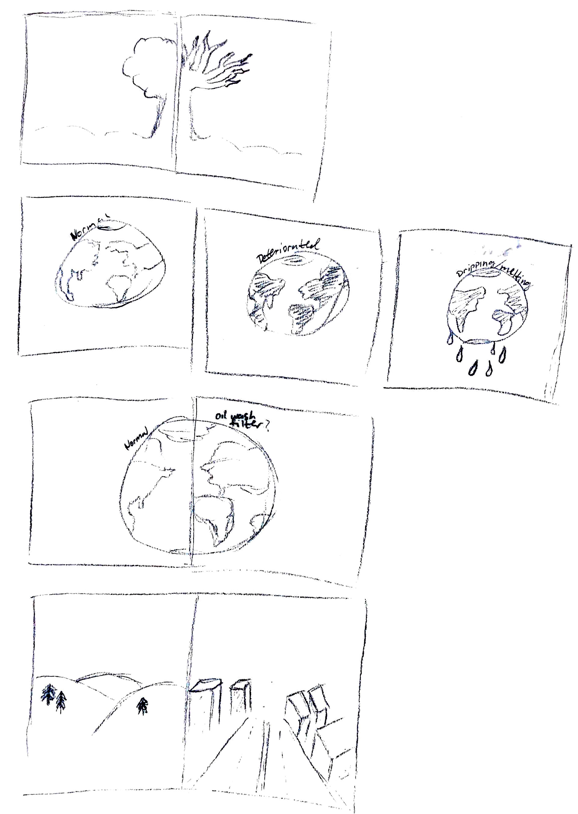
Inside Album Cover Sketches
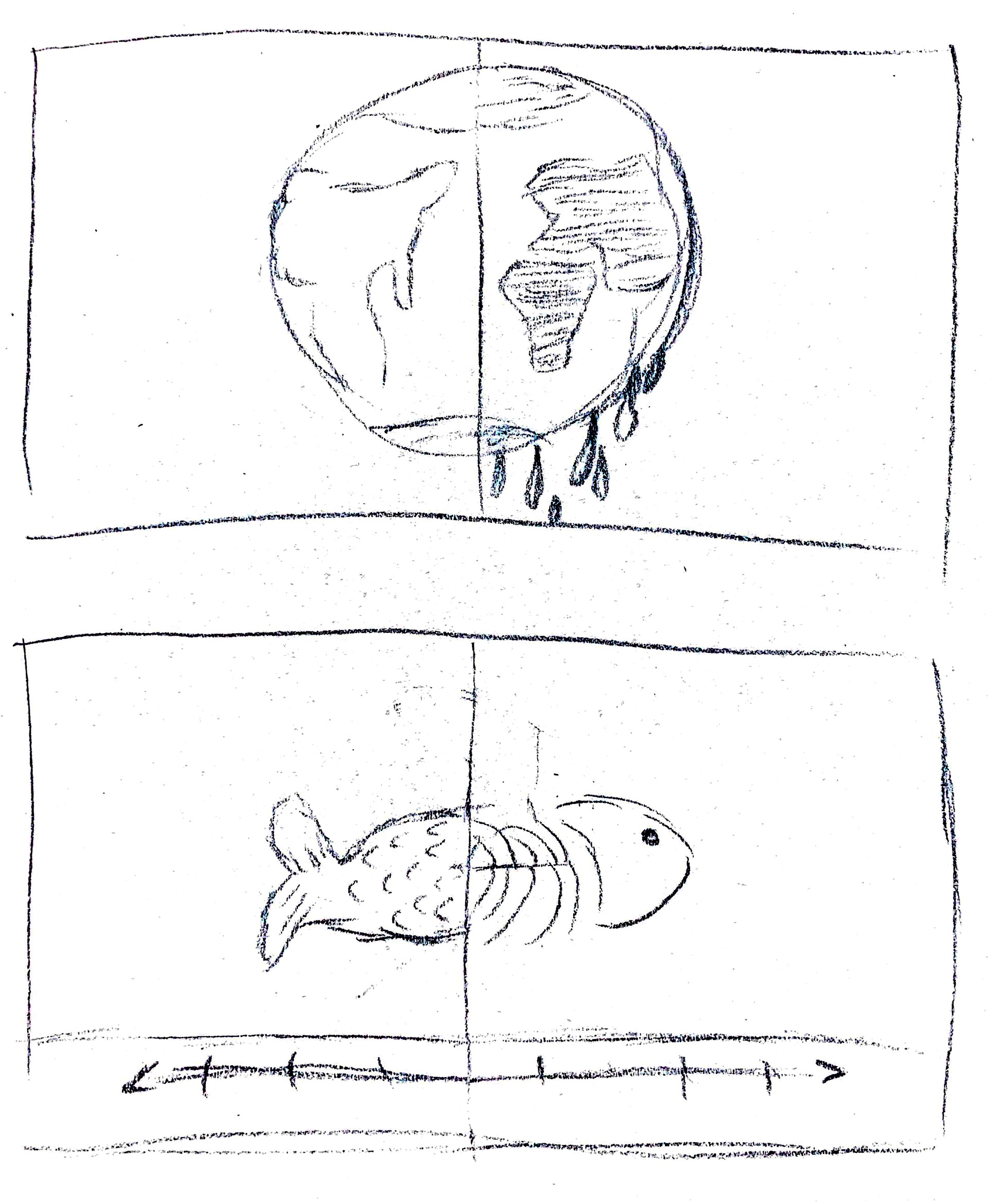
Inside Album Cover Sketches

Color Scheme Exploration

Color Scheme Exploration
Color Scheme Exploration
Color Scheme Exploration

Color Scheme Exploration
Inside Album Cover Layout Sketches
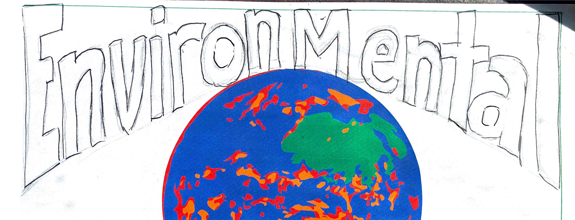
Inside Album Cover Layout Sketches
Inside Album Cover Layout Sketches
Inside Album Cover Sketches
Inside Album Cover Sketches
Inside Album Cover Layout Sketches
Social Media Feedback
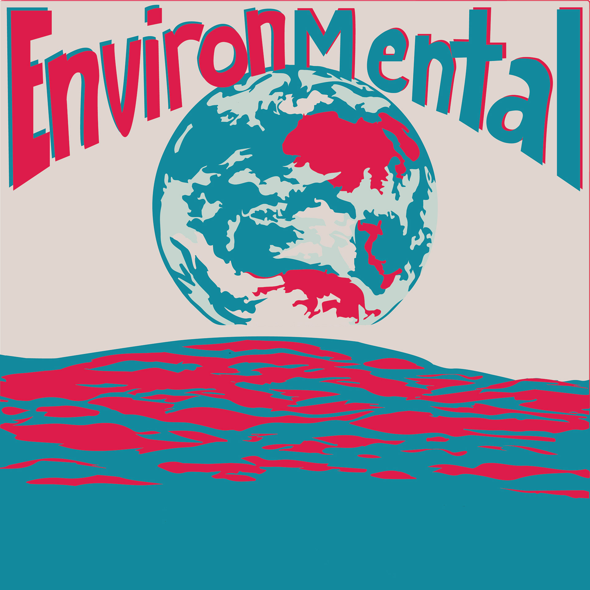
As I worked on the inside cover design for the EnvironMental album, I used a social media poll to receive feedback on what color scheme to use for the project. For the sake of simplicity, I displayed what I considered to be the two strongest color palettes I had worked with and posed the question, “Which psychedelic color palette you vibin’ with?” Initially, the poll results were tied for a while, but after more people participated, the pink, teal, and light tan color palette became the clear winner.
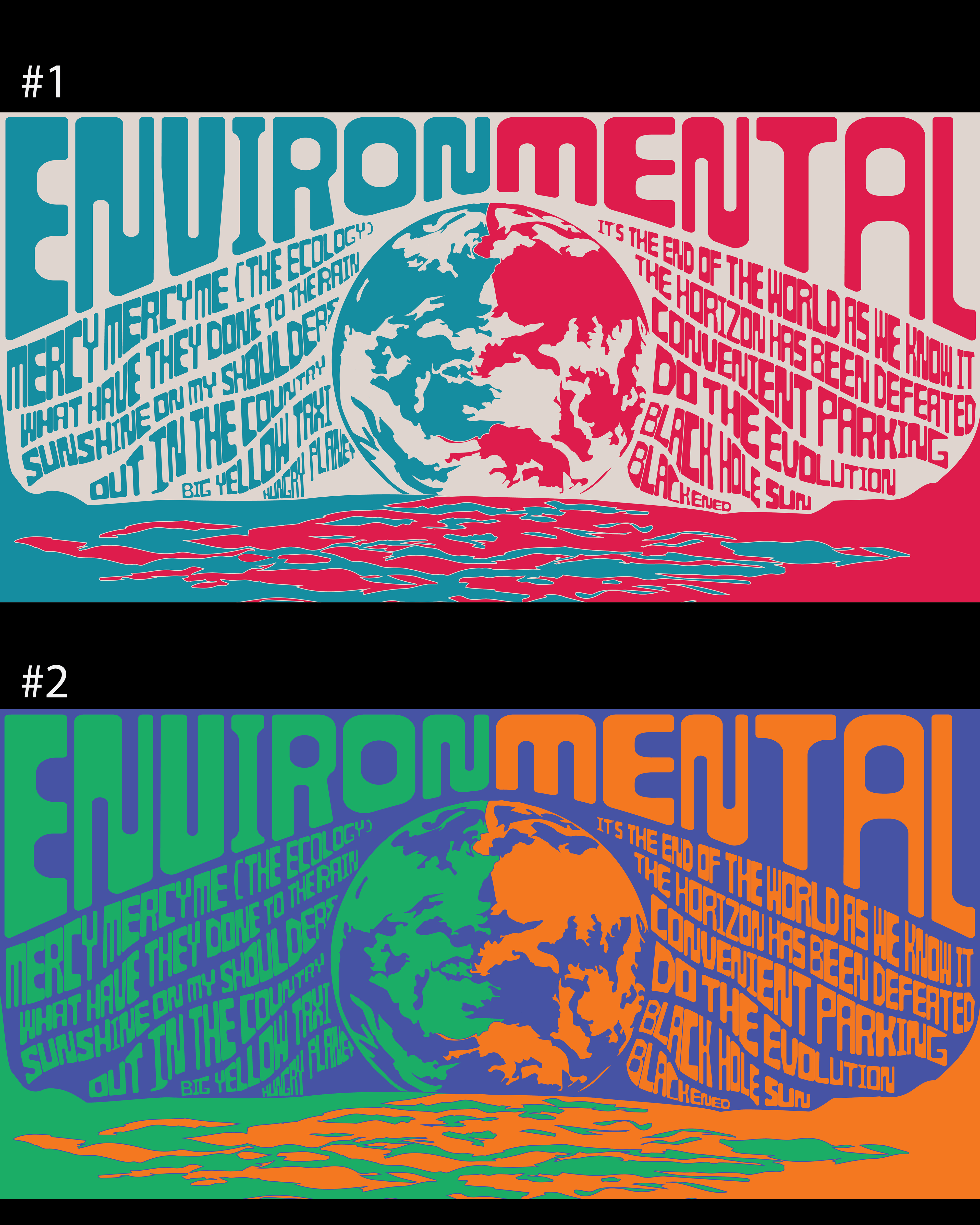
EnvironMental Color Scheme Options
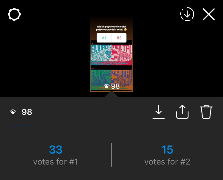
Instagram Poll Results
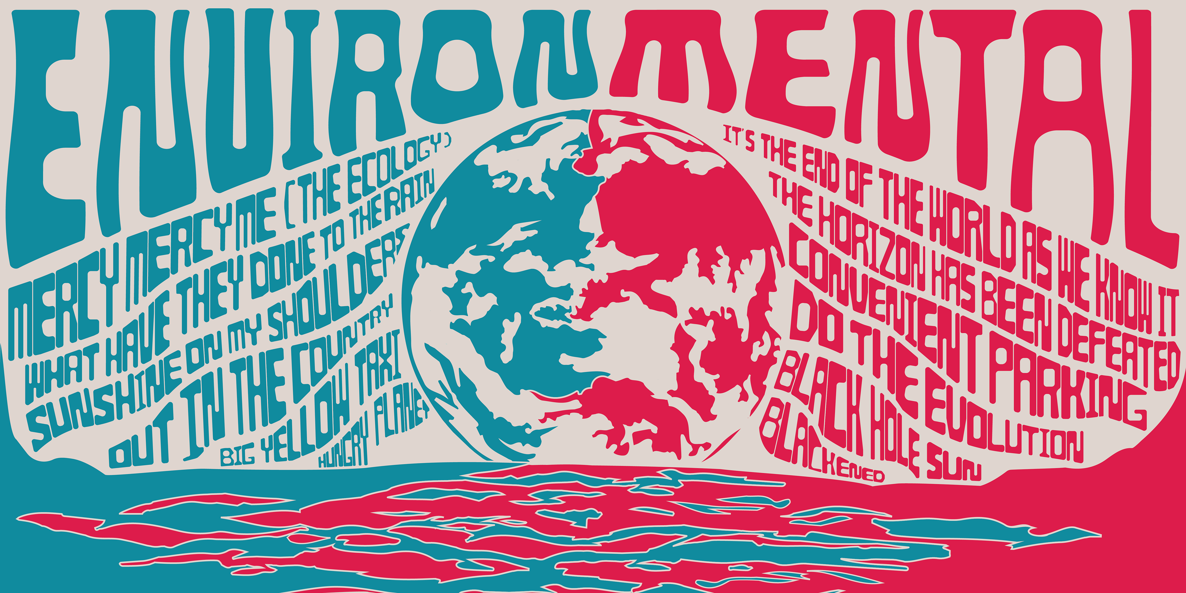
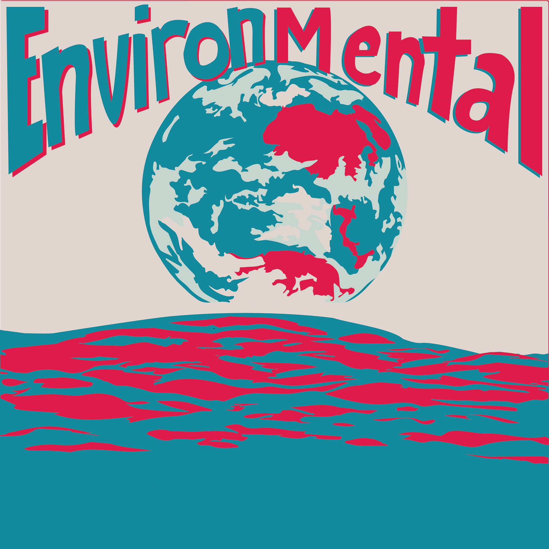
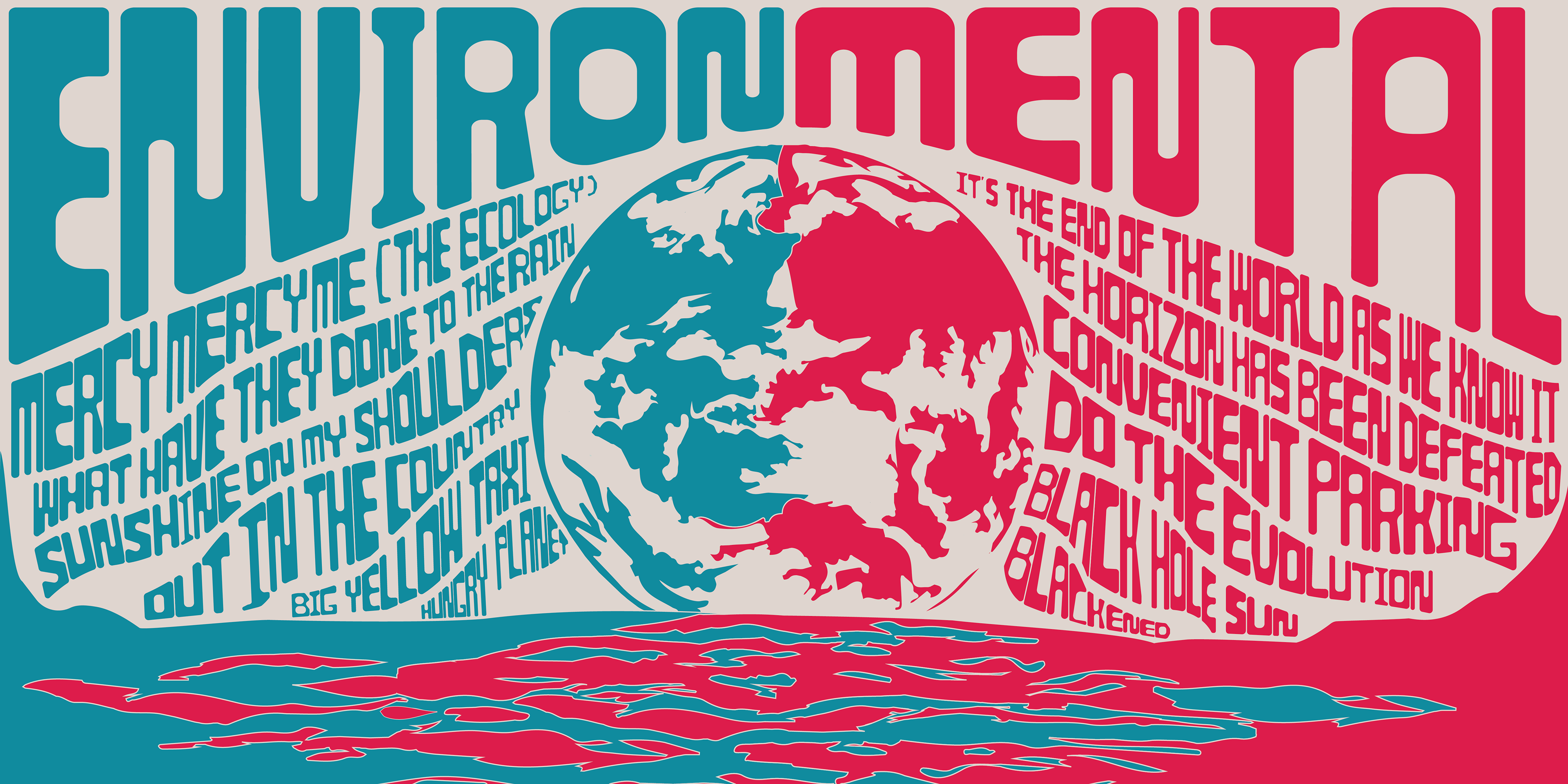
Winning EnvironMental Inside Cover Design
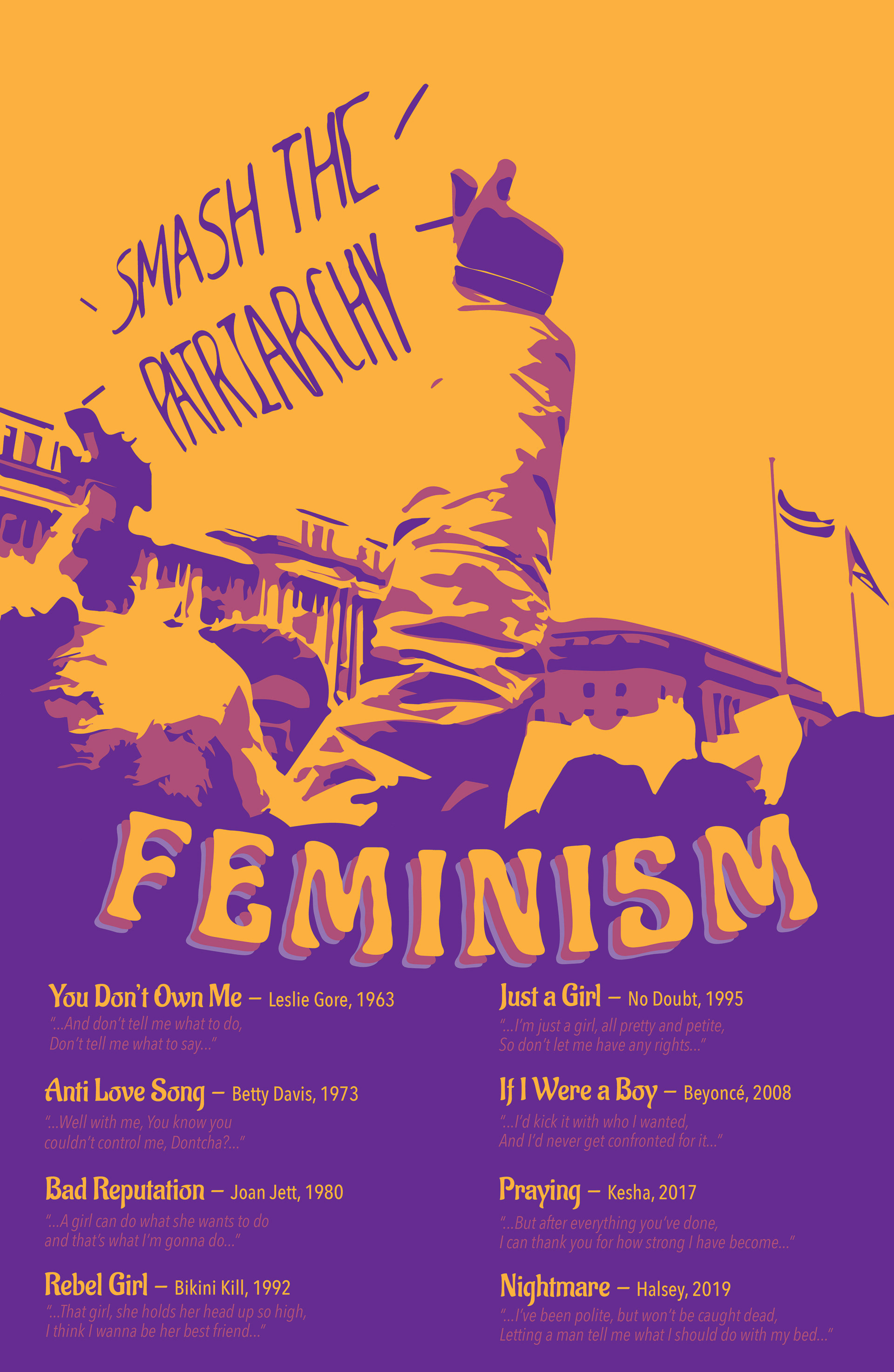
Front Cover
After developing the inside cover for the EnvironMental album, I began iterating designs for the front cover that would feel cohesive in style. After generating a few different ideas, I got some feedback from my friends (who are also graphic design majors). Based on their feedback as well as the feedback I received from my teacher, I ultimately ended up refining design #4.

Front Cover Design #1

Front Cover Design #2
Front Cover Design #3
Front Cover Design #4
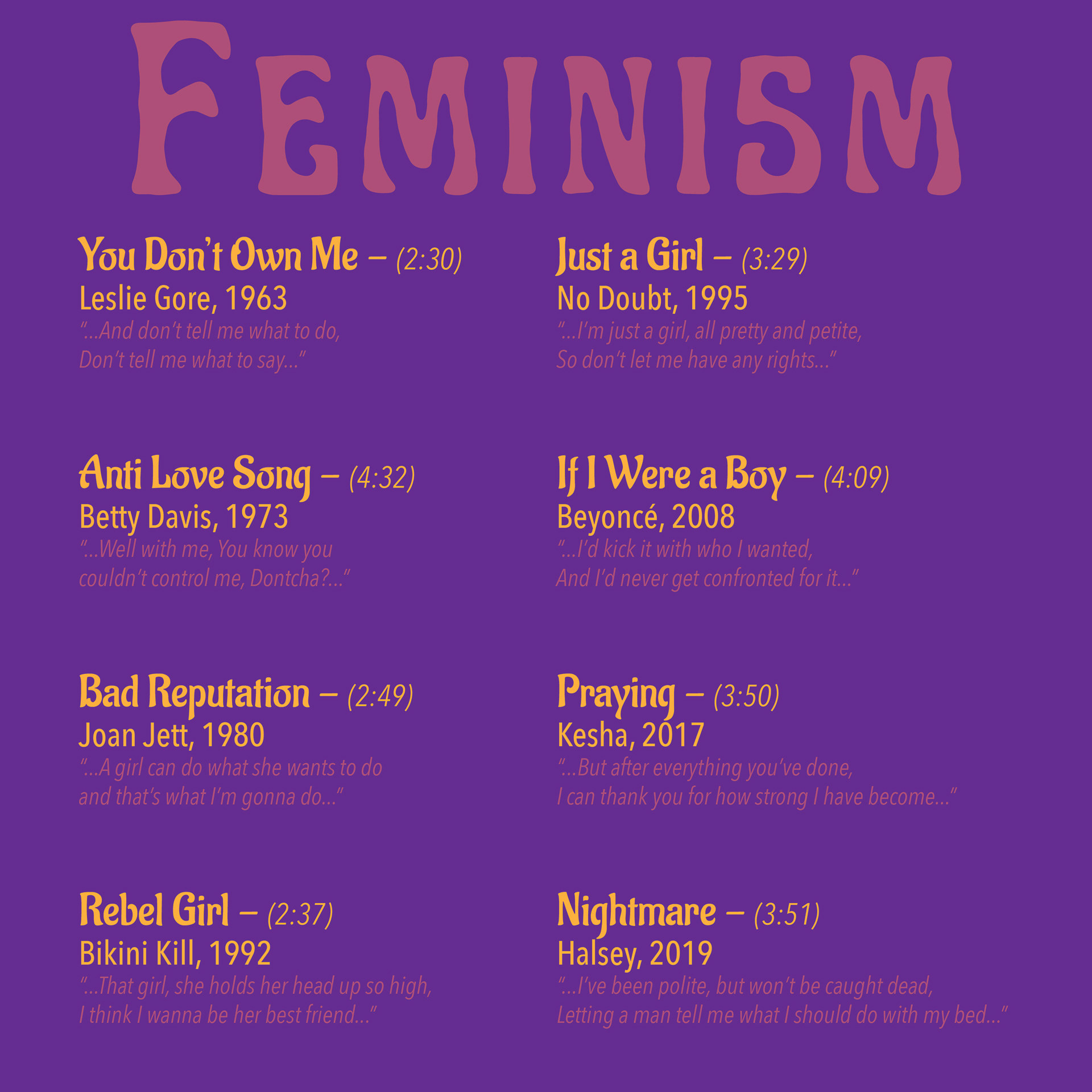
Album Back Cover
On the back cover of the EnvironMental album, I listed the tracks I had selected for the album. The selected tracks covered a time range spanning from the 1960s to the 2010s. Each song name had a tie to a topic of environmentalism and was subsequently paired with a scientific fact about the state of the environment. I experimented with a few different layout options, but ultimately ended up focusing on refining design #3. I felt like this design would be the most cohesive with the front cover of the album because it maintained the rounded appearance of the album title shown on the front cover.

Album Back Cover Design #1

Album Back Cover Design #2

Album Back Cover Design #3
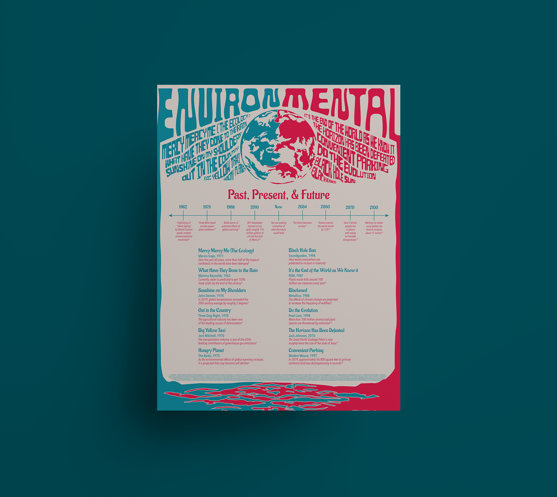
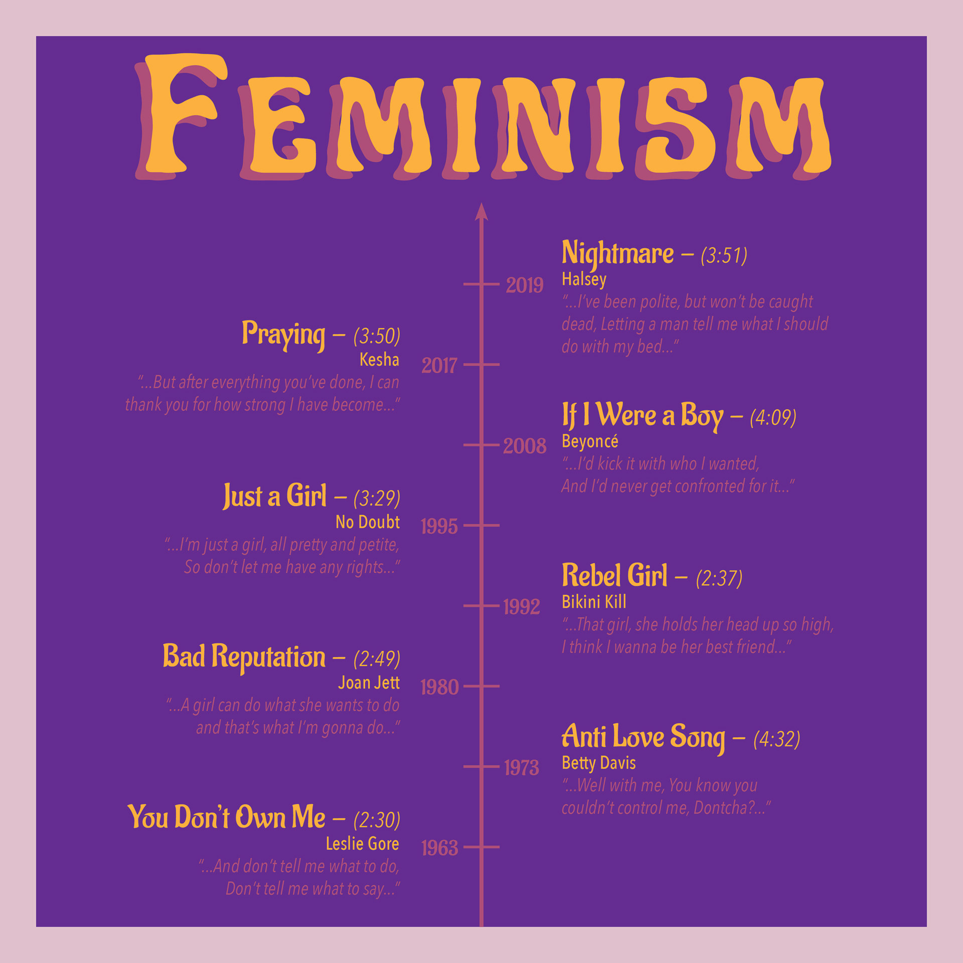
Poster Design
For the poster accompanying the EnvironMental album, I focused on reusing elements from the album covers to maintain a sense of uniformity across the deliverables. I did this by using the parts of the design of the inner cover of the album to frame the poster. I also showed the track listings with their respective facts as well as a timeline showcasing environmental events of the past and of the possible future. I felt like incorporating this timeline of what the future of the environment could hold would act as something of a call to action for the audience. I ultimately ended up refining poster design #2.
Poster Design #1
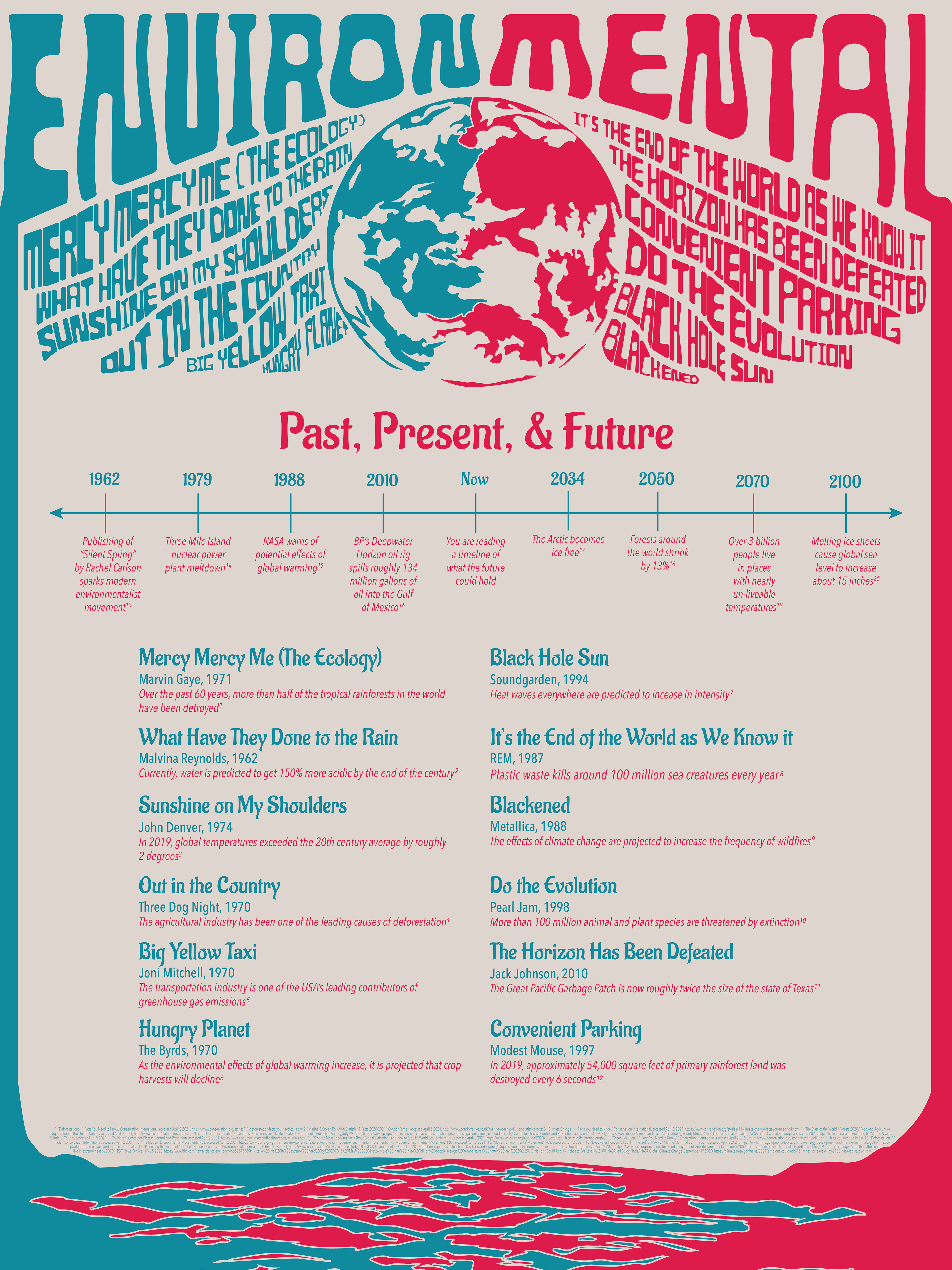
Poster Design #2
Final Exhibition
Senior Capstone Showcase
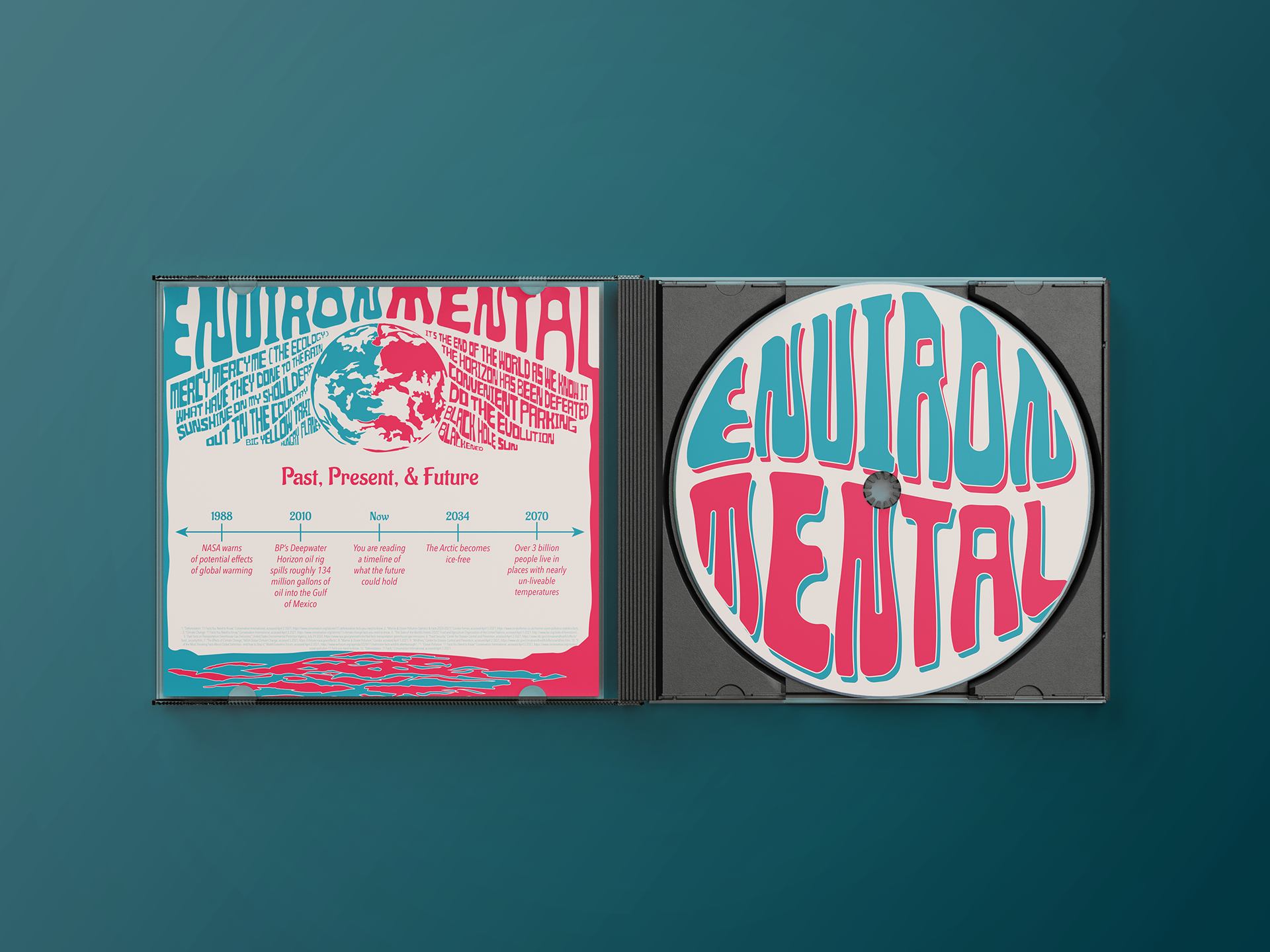
After finalizing all of my work, I began producing physical deliverables to be displayed at the Capstone exhibition. I had my poster design printed at Stevenson and trimmed with an X-acto Knife. I also printed my album covers through Stevenson. I trimmed them and later adhered the prints to the cover of a cheap record I had purchased in order to create my mockup. I also printed a CD cover and insert through Staples for my project. I also had stickers of the album cover design printed through Valley Graphics Service as a takeaway for my display. The overarching goal of my project was to create a cohesive brand identity for a social movement combining music and graphic design. Furthermore, I wanted my project to help open people’s eyes to how the Earth is impacted by our actions and how these effects will become increasingly detrimental if they continue.
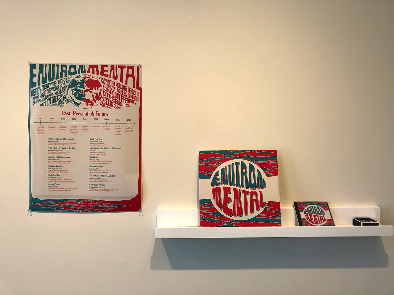
Senior Capstone Showcase Exhibition
Conclusion
From my project, I learned a lot about what goes into creating psychedelic art and typography. I also became more aware of the importance of having multiple sources of feedback at various points in the design process (e.g. the feedback I received from the Pop-Up event, from classmates in breakout rooms, as well as social media. If I were to build upon this project, I would try to find ways to expand the reach of the brand. This would likely be done the integration of more digital components such as a website, social media platform, app, or QR code on stickers leading to a Spotify or YouTube playlist of the songs featured on the EnvironMental album. In addition, I think it may also be beneficial with the campaign to provide the audience with resources to help them act on the information presented to them. This could include something like a beach clean-up event or information regarding wildlife preserves in need of donations.
Sources
2016. “The relation between typography and music genres, explained.” Typeroom. https://www.typeroom.eu/article/relation-between-typography-and-music-genres-explained
2021. “Countercultures.” Social Science LibreTexts. https://socialsci.libretexts.org/Bookshelves/Sociology/Introduction_to_Sociology/Book%3A_Sociology_(Boundless)/03%3A_Culture/3.04%3A_Culture_Worlds/3.4B%3A_Countercultures
Ebert, Luke. “Typography of Music.” Luke Ebert Design. https://lukeebertdesign.com/Typography-of-Music
Kipp, Marianne. 2019. “How to design an album cover: the ultimate guide.” 99designs. https://99designs.com/blog/design-other/how-to-
design-album-cover/#color
design-album-cover/#color
“Music and Social Justice Movements.” TeachRock. https://teachrock.org/collection/music-social-justice-movements/
Nicholls, Tracey. “Music and Social Justice.” Internet Encyclopedia of Philosophy. https://iep.utm.edu/music-sj/
Wentz, Ashley. 2013. “The Power of Music in Storytelling.” Centerline Digital. https://www.centerline.net/blog/the-power-of-music-
in-storytelling/
in-storytelling/